At Bueno, we've always prided ourselves on offering a diverse range of digital creation tools that empower artists and creators.
March 12, 2024
Reimagining Bueno: Unifying Creativity with New Branding

With this broad set of digital tools comes the challenge of unifying each product under the Bueno brand. It's a challenge that the team embraced enthusiastically with a full head of steam in our latest rebranding initiative. Today, we're thrilled to unveil a new face for Bueno that harmoniously brings together our products under a cohesive brand identity.
But our rebranding is way more than just a new look; it reflects our philosophy that the new visuals and aesthetic should be as intuitive and user-friendly as our products.
It all ties back to building a seamless experience where our brand mirrors the elegance and efficiency of our product design. In other words, we wanted to ensure a unified and consistent experience for our users.
In writing this, I wanted to give you an insider's perspective on the changes we're making so you can see how we're shaping the brand and your experience with it.
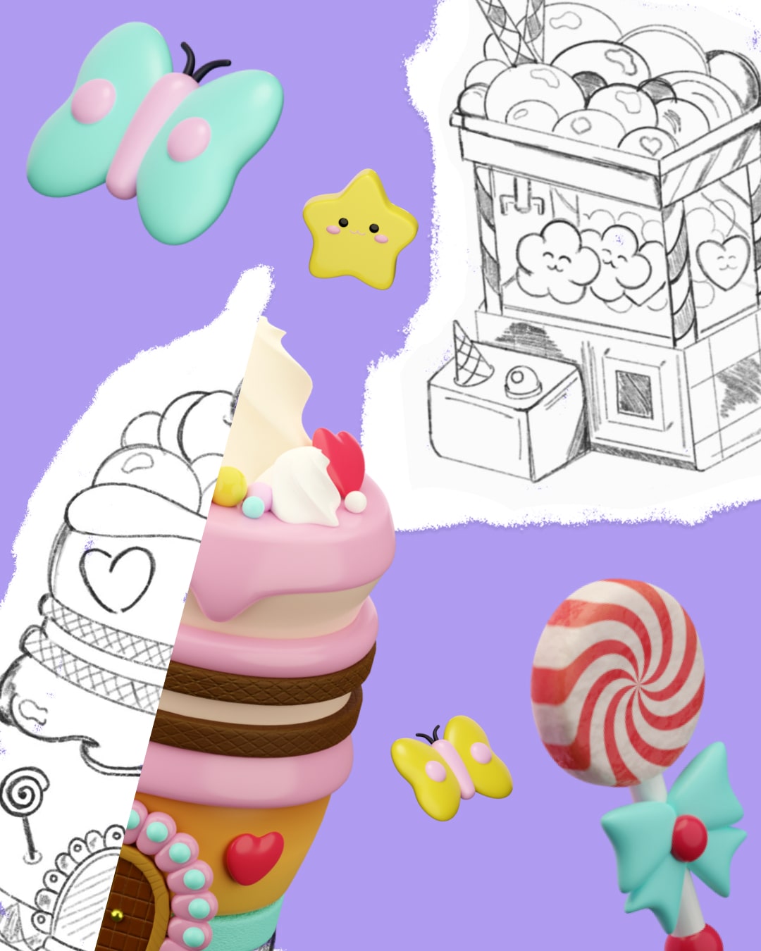
Your art takes center stage
One of the keys to our rebranding is letting our users' art play a central role in our design. Our new branding style is deliberate, clean, simple, and predominantly black and white, which helps highlight the incredible projects made using our tools.
.gif)
Another way of thinking about it is that this new look is about enhancing the vibrancy and diversity of the art created using our tools. It's a rebranding that celebrates creativity, where our users' art speaks just as loudly as the brand itself.
Aesthetics that reflect our level
In the competitive landscape of digital creation tools, standing out is critical. We know where our tools stand in terms of other similar products out there, and the new branding reflects our role as a major player in this space.
This new visual identity is an aesthetic upgrade and a statement of our quality, innovation, and commitment to excellence in digital art and creative technology.
More flexible, more adaptable
Flexibility and adaptability are at the heart of this creative endeavor, and our new branding reflects this ethos. We've laid a foundation that's not just for the present but also the future, a flexible brand framework that can evolve with our expanding range of features and products.

A new mobile experience for creators.
This adaptability ensures that as we grow and innovate, our brand remains up to pace with what our community has come to expect from us as a top-tier set of creative tools.
Haffer feels right
A standout feature of our new branding is the introduction of the Haffer font. This distinctive, modern typeface is more than just a typographic choice; it reflects our brand's bold, creative, and forward-thinking personality.
When working on this new look, one of my designer colleagues said something, "Haffer just feels right. It feels like us!"
I loved that because it is so true; Haffer perfectly captures our brand's voice, resonating clearly and confidently across all communications.
A new brand look, the same drive for excellence
Our new branding is about taking a bold step forward, and creating visual harmony that aligns with our mission to provide the best tools for digital creators.
This rebranding represents our commitment to keeping pace with the industry and setting the standard for excellence, ensuring that as our range of products expands, our brand remains synonymous with creativity, quality, and user-centric design.
It's a celebration of creativity, a testament to our growth, and a promise of our commitment to continually empower you and the rest of this incredible artistic community.